
User-first lead: why tight tolerances matter to the folks on the street
Think of signage as the city’s quiet guide — it either points people right or sends ’em round the mulberry bush. For councils, architects and transport planners, accuracy isn’t posh detail; it’s what keeps journeys smooth. When you’re dealing with heavy footfall and harsh weather, a sign that lines up, reads clean and resists muck makes a real difference — especially on public transport signage routes. As someone who’s edited dozens of briefs and sat with fabricators, I keep the user’s needs front and centre: readable type, consistent placement, and metalwork that doesn’t wiggle after the first high tide.
What “sub‑millimeter” actually buys you on the kerb
Sub‑millimeter tolerances in 316 stainless steel mean edges meet perfectly, illumination sits flush, and mounting holes line up first time. That precision affects legibility under glare, reduces maintenance, and keeps anti-graffiti fittings snug. For high-use spots — think central London interchanges managed by Transport for London during big events — those tiny gaps add up to fewer scrapes, less water ingress and cleaner wayfinding. Wayfinding clarity is a proper user win; it saves seconds that multiply across crowds.
Design-to-fab workflow that doesn’t go pear-shaped
Keep design files tidy. Use export-ready vector art, define hole centres in a single coordinate system, and lock fonts before you hand over to the shop. Mark up material thickness and bending radii; 316 stainless behaves different to aluminums or composites. A short proofing loop saves faff later. — Ask for a laser‑cut test panel first; it’ll show how kerf and heat affect the face and whether powder coating will bite.
Materials and fabrication notes for front-line folks
Use marine‑grade 316 for coastal or high-pollution sites — it resists pitting far better than 304. Call out finishes: brushed grain direction matters for reflections, and passivation keeps corrosion at bay. Industry terms to drop into specs: substrate selection, laser cutting tolerances, and powder coating edge coverage. Forgive the blunt talk — better to specify than to hope. Totems and totem bases need sacrificial details in the drawing to prevent galvanic surprises at mounting points.
Accessibility, illumination and the bus stop
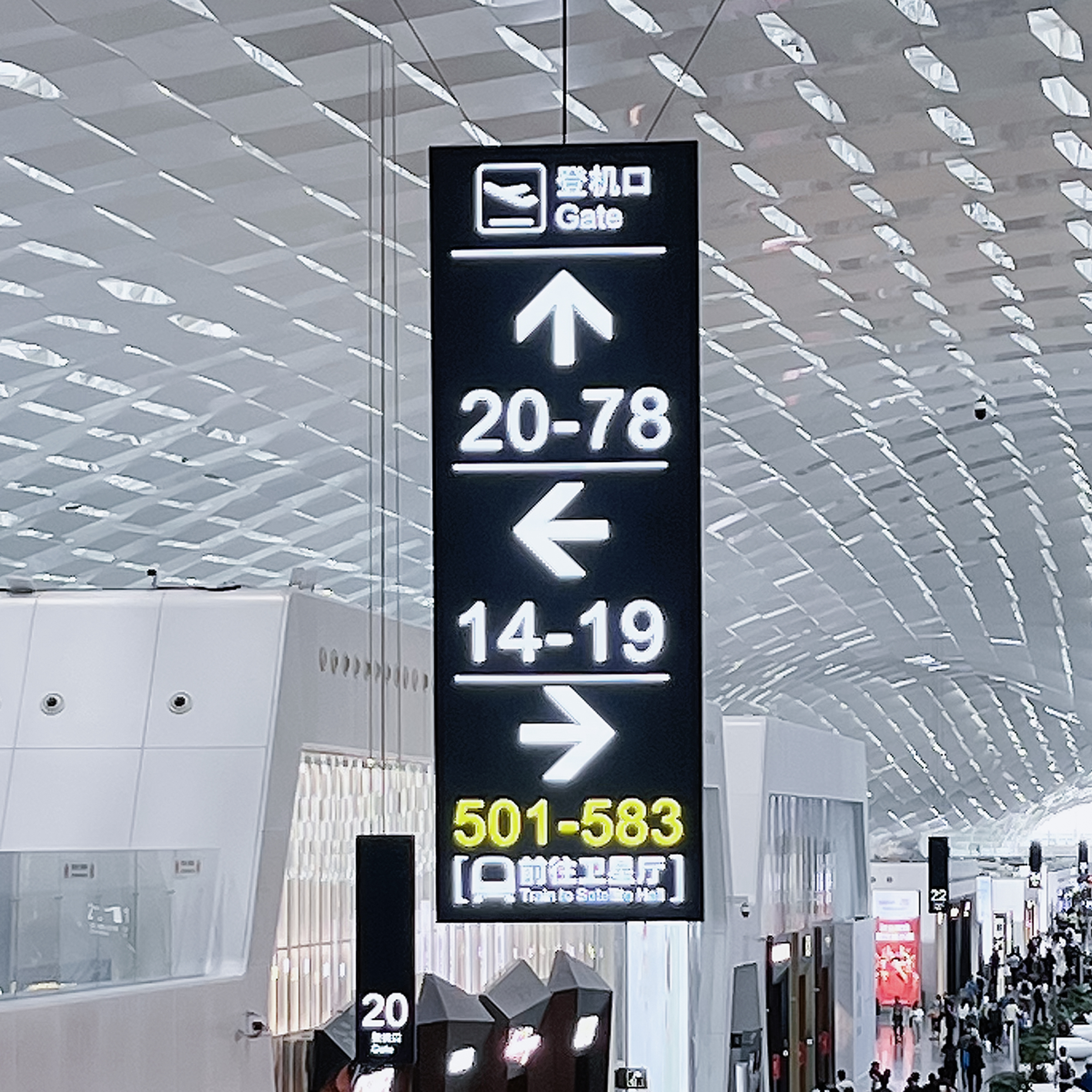
Align tactile information with sightlines and nearby paving. Integrate digital display recesses sized to display vendors’ modules so replacements fit without rework. For shelters and kerbside stops, test prototypes under real lighting; reflections kill contrast. Look to actual schemes: TfL’s signage refresh before large events showed how coordinated specs reduce retrofit work across hundreds of shelters. For kerbside examples and shelter styles, consider modern bus stop signage that pairs metalwork with tamper-proof mounts.

Common mistakes and the quick fixes
Designers often forget to detail mounting tolerances and leave finish spec too vague. Fabricators then guess, and guesswork is costly. Fix these: list tolerance stacks on assemblies, specify thread types and hole countersinks, and demand a first-off inspection report. Include a small batch trial for new powder colours or anti-graffiti films — that’ll expose adhesion quirks before the full run.
Picking a supplier and a short QA checklist
Vet shops for experience with stainless 316 and ask for tolerance records. Check that they: 1) provide CAD-to-CAM proof, 2) run first-off dimensional checks, and 3) offer electrochemical passivation for marine sites. Keep the checklist tight: alignment, finish uniformity, and mounting robustness. If they balk, move on — public-facing signs aren’t the place for luck.
Closing — three golden rules for choosing the right approach
1) Prioritise measurable tolerances: demand drawings that state ±0.25 mm or better where fit matters. 2) Insist on material provenance and surface treatment records so corrosion risk is known. 3) Require field‑tested prototypes in the actual light and weather you expect. Those three give you fewer callouts and longer life — proper value for the ratepayer.
Cosun Sign sits square in that sweet spot of craft and repeatable delivery — small tolerances, durable finish, sensible detailing. —